
development thread (art, writing, etc)
-
fabulaparva

- Elder Druid
- Posts: 761
- Joined: Sun May 04, 2014 9:58 pm
Re: development thread (art, writing, etc)
Woot! Sounds even more promising. Thanks for the answer :D
-
jack1974

- Pack leader
- Posts: 15479
- Joined: Thu Jun 16, 2005 4:43 pm
Re: development thread (art, writing, etc)
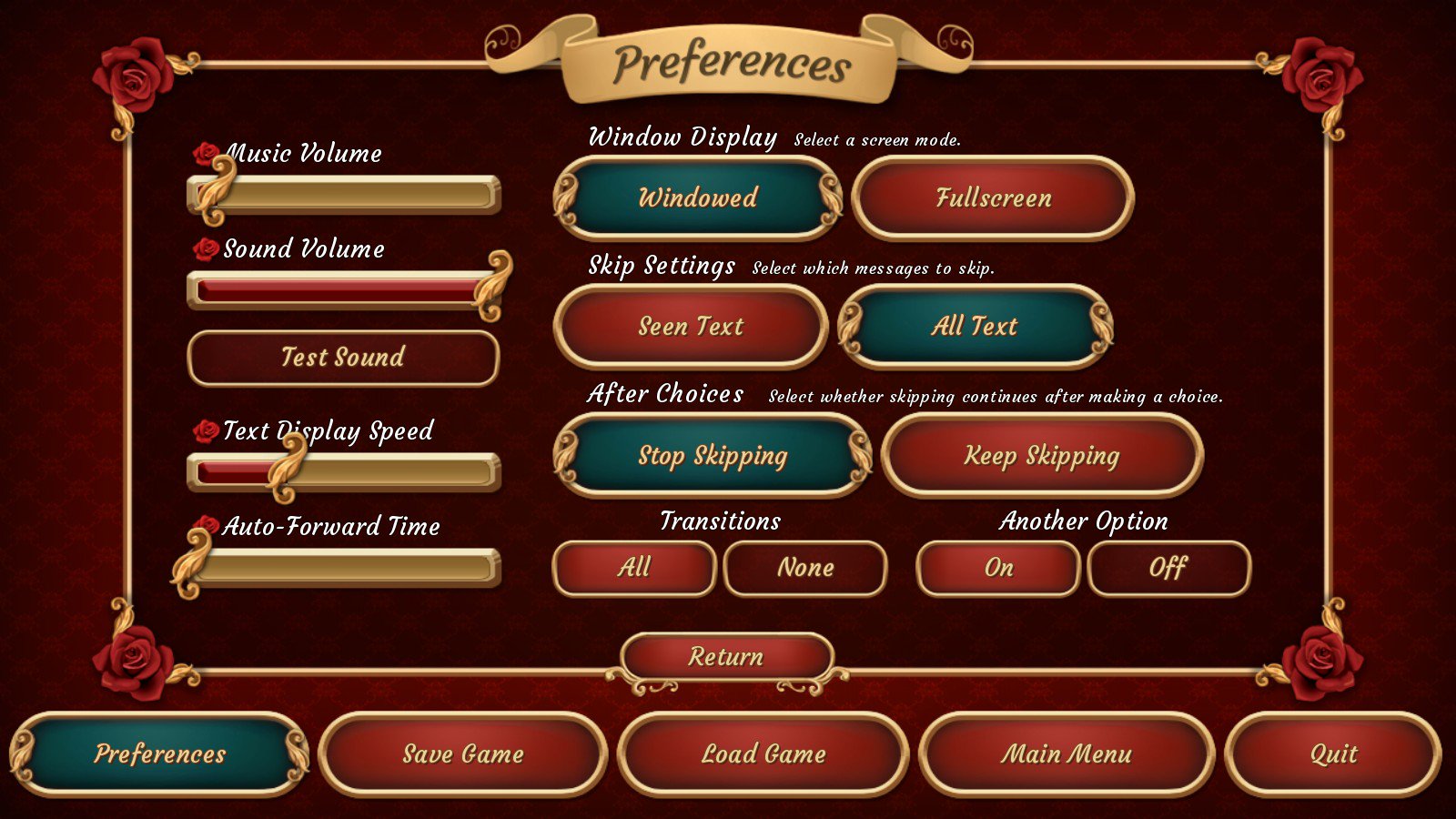
the GUI for this game turned out so good! I must reuse it for other future games
-
Katicflis
- Young scout
- Posts: 87
- Joined: Thu Nov 08, 2012 8:19 pm
Re: development thread (art, writing, etc)
Looks great! Extremely feminine, but great!
-
Alex81
- Woods ranger
- Posts: 157
- Joined: Wed Feb 16, 2011 1:44 am
Re: development thread (art, writing, etc)
That's...... perhaps the best looking UI I've seen so far.
 Looks like it belongs in the Austrian Imperial court or something
-
kadakithis
- Druid
- Posts: 284
- Joined: Wed Jan 14, 2015 7:32 am
Re: development thread (art, writing, etc)
Amazing GUI!
-
pahldus

- Woods ranger
- Posts: 167
- Joined: Wed Sep 30, 2015 8:30 am
Re: development thread (art, writing, etc)
Agree that GUI is really nice, easy on the eyes and easy to understand.
-
rooke30
- Young scout
- Posts: 52
- Joined: Mon Dec 02, 2013 7:44 am
Re: development thread (art, writing, etc)
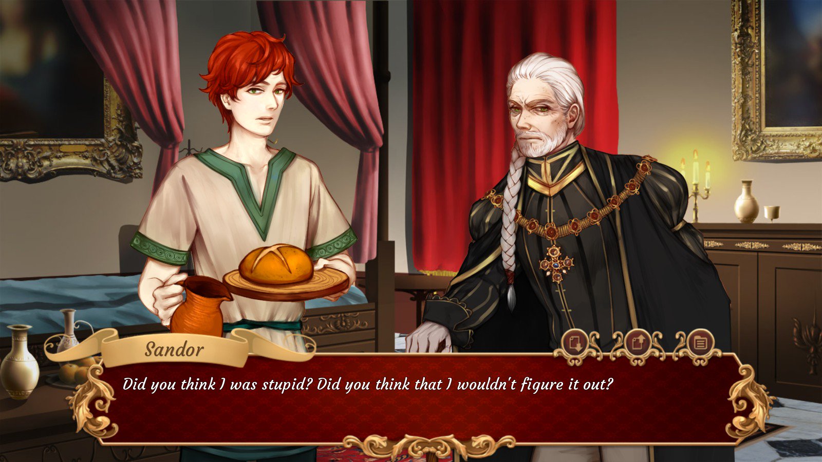
I don't know whether you're aware, but while the screenshots look lovely you're taking a bit of a risk. It has been suggested that large sections of italic font decreases readability, which is one of the reasons you usually see it as a form of emphasis or to denote something is different. But every screen I've seen from this VN is in italics, which could be off-putting to a section of potential buyers (I'm not talking about your core fans, here.) So you might want to quickly check that doesn't affect people negatively
Italics font makes for a beautiful script, so if it's incredibly pretty to the eyes you'd have to assume there's a pretty strong downside to match, otherwise we'd see it in books and games everywhere. But we don't ... not in large sections anyway.
Italics font makes for a beautiful script, so if it's incredibly pretty to the eyes you'd have to assume there's a pretty strong downside to match, otherwise we'd see it in books and games everywhere. But we don't ... not in large sections anyway.
-
jack1974
- Pack leader
- Posts: 15479
- Joined: Thu Jun 16, 2005 4:43 pm
Re: development thread (art, writing, etc)
Ah OK thanks for the info. It is actually the font design itself, which makes it look like italic indeed. But while I'll keep it in the options/menu I can always change it for the main dialogue window
-
jack1974
- Pack leader
- Posts: 15479
- Joined: Thu Jun 16, 2005 4:43 pm
Re: development thread (art, writing, etc)
started working on this officially, doing the scheduler/gameplay/basic testing. It has already been completely scripted. Maybe beta will begin at end of April
-
Alex81
- Woods ranger
- Posts: 157
- Joined: Wed Feb 16, 2011 1:44 am
Re: development thread (art, writing, etc)
Admit not my favourite genre -but- as I really -really- love (what I've seen of) Silverhyena's previous work (especially Mira's magical mishap (Though Sacred Sand was good too) this would be foolish to miss out on
That the art here is -really- well done and the game looks so nice already helps too. ^^ Another mustbuy from WW
That the art here is -really- well done and the game looks so nice already helps too. ^^ Another mustbuy from WW